PORTFOLIO: Logo and Identity Design
Thoughts on Identity
Every company or organization has an identity by either plan or default. Your identity works for you on both ends of the customer experience. On the front end it is your voice that you communicate the promise of your brand. And as you are dedicated to fulfilling that promise to your customers on the other end, your identity is working for you on the folllow through and repeat associations to reinforce a memorable face or hook to hang a positive impression that will continue to build through consistent delivery on your promises. As your trustworthiness is established by your service and products, it is cemented in your customer's consciousness by your identity applied in a consistent and engagingly entertaining manner.
Every company or organization has an identity by either plan or default. Your identity works for you on both ends of the customer experience. On the front end it is your voice that you communicate the promise of your brand. And as you are dedicated to fulfilling that promise to your customers on the other end, your identity is working for you on the folllow through and repeat associations to reinforce a memorable face or hook to hang a positive impression that will continue to build through consistent delivery on your promises. As your trustworthiness is established by your service and products, it is cemented in your customer's consciousness by your identity applied in a consistent and engagingly entertaining manner.
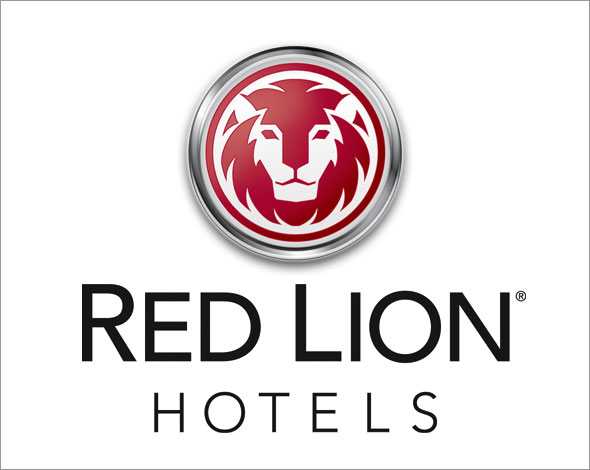
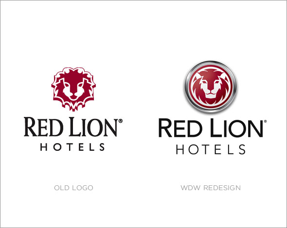
Red Lion Hotels Corporation
Timed to coincide with a $40+ million property improvement plan, the redesign of the Red Lion Hotels identity represented a unique challenge to refresh a beloved icon that had grown a little long in the tooth. While explorations were made that could have been a radical departure, it was finally decided upon a look that retained a good deal of the equity this brand had earned over the years but also brought a new, stronger, more mature presence to the brand. No longer just a "cute and cuddly" lion cub, the new design takes a more aggressive stance and by displaying strength and wisdom, it helps to create a sense of a protective, proactive guardianship that ensures that each of their guests "Stay Comfortable."
Timed to coincide with a $40+ million property improvement plan, the redesign of the Red Lion Hotels identity represented a unique challenge to refresh a beloved icon that had grown a little long in the tooth. While explorations were made that could have been a radical departure, it was finally decided upon a look that retained a good deal of the equity this brand had earned over the years but also brought a new, stronger, more mature presence to the brand. No longer just a "cute and cuddly" lion cub, the new design takes a more aggressive stance and by displaying strength and wisdom, it helps to create a sense of a protective, proactive guardianship that ensures that each of their guests "Stay Comfortable."
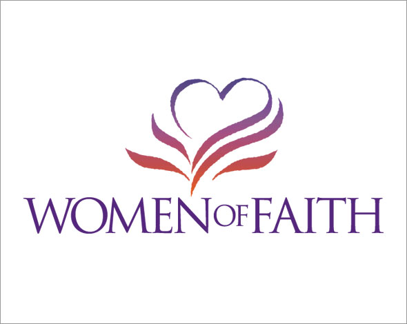
Women of Faith
Women of Faith is a ministry that holds conferences in civic arenas in cities all over the country, encouraging women in their faith, with over 300,000 women attending each year.
Produced for David Riley+Associates, the mark captures many aspects of the essence of the feminine side of faith–from the spirit-filled life, represented by what could be seen as flames or the branches of a plant growing up into a heart. This mark has come to represent a woman's joyful embrace of life empowered through her faith in God.
Classical Christian Academy
After working together on a new website and brochure, Classical Christian Academy in Post Falls, Idaho approached WDW to create their mascot logo which would also become their identity.
Being a Christian school, one challenge was keeping the design worthy of respect without being overtly aggressive. The Centurion communicates a disciplined strenth under restraint but more than capable of delivering a mighty fight when the time calls for it. One interesting fact that came from our research was that everytime a Centurion was mentioned in the Bible it was in a positive light.
enablegroup.com
An internet consulting firm, EnableGroup.com, originally located in Coeur d'Alene, Idaho, is exactly what their name implies; specializing in working for non-profit ministries, they have sought to "enable" their clients to fully leverage the internet and make the transformation to the digital economy.
The mark that was developed for them while at first glance, appears as a stylized "E", but also works into a play on the infinity symbol, with the obvious reference to the "infinite" possibilities and potential of the internet.
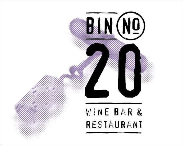
Bin No. 20 Wine Bar & Restaurant
The Tri-cities is located in the heart of Washington's wine country. While the area's wines have grown in prestige in recent years, the area has resisted the trendy, snobby image associated with the Napa/Sonoma wine growing regions of California.
So, Red Lion Hotel Pasco set out to establish a more down-to-earth setting to enjoy a good meal paired with a great glass of wine (or two) while still retaining an air of sophistication. The result is, Bin No. 20. Proudly showcasing one of the best selections of northwest wines. Their identity needed to reflect authenticity yet stay unpretentious.
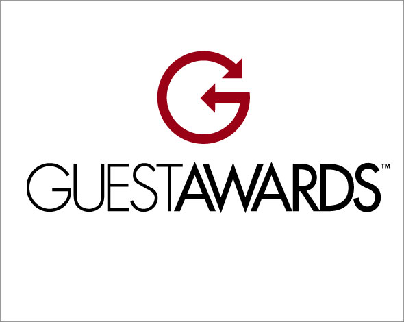
GuestAwards
GuestAwards is the frequent guest program offered by Red Lion and WestCoast Hotels headquartered in Spokane, Washington. Guests earn points or airline mileage whenever they stay at the hotel. The identity had to stand on its own while not competing with the parent brands when used on ads and support collateral.
The design of the stylized "G" incorporates directional arrows suggesting all the places you can travel and take advantage of the GuestAwards program.
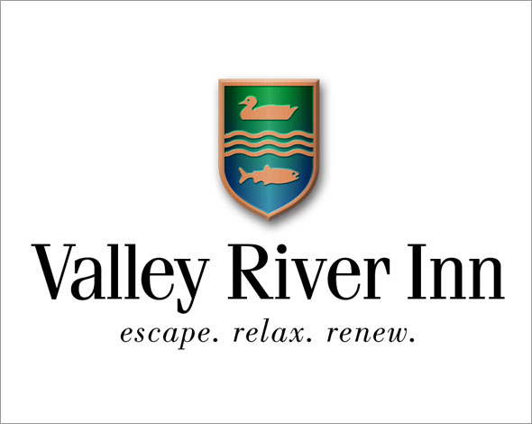
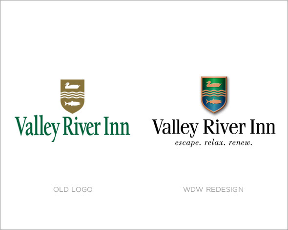
Valley River Inn
Valley River Inn in Eugene, Oregon approached WDWerks to help redefine their branding strategy and further cement their leadership status within the Central Oregon hospitality market. The original directive was not to change the logo but as work progressed on the new materials, a solution was presented that was met with hearty approval not only by the executive marketing team, but by the sales people and staff that were charged with trying to attract a steady stream of new business to the property that had not changed much in the past 30 years. They had relied on that stability but now recognized the opportunity to infuse new life into the property that the people of Eugene have come to love as part of the heart of their town.
Valley River Inn in Eugene, Oregon approached WDWerks to help redefine their branding strategy and further cement their leadership status within the Central Oregon hospitality market. The original directive was not to change the logo but as work progressed on the new materials, a solution was presented that was met with hearty approval not only by the executive marketing team, but by the sales people and staff that were charged with trying to attract a steady stream of new business to the property that had not changed much in the past 30 years. They had relied on that stability but now recognized the opportunity to infuse new life into the property that the people of Eugene have come to love as part of the heart of their town.
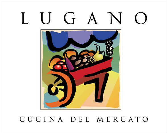
Lugano Cucina Del Mercato
Lugano Cucina del Mercato is a trendy Italian restaurant located across the street from South Coast Plaza in Costa Mesa, California and easy walking distance from the Orange County Performing Arts Center.
The owner of Lugano was looking for a sophisticated, yet unpretentious mark that captured the essence of a café set in the context of an outdoor marketplace. Using a vibrant yet slightly subdued color pallette, we used a minimilized hand-drawn style of a merchant's cart loaded with fresh faire to capture the southern European atmosphere of the agoura.
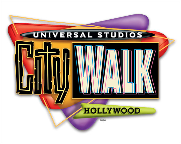
CityWalk - Universal Studios
CityWalk is an endless celebration of sight, sound and taste. Modeled after outdoor retail areas such as Third Street Promenade in Santa Monica, Universal Studios has captured the best of shopping, dining and entertainment all in one location. With locations in both Hollywood, California and Orlando, Florida.
Produced for David Riley+Associates, the CityWalk logo sought to capture the dynamic, "over-the-top" Hollywood neon energy of the CityWalk experience. The design also lent itself to fantastic signage applications at both locations.
Dynamic Health
Dr. Anthony Smith’s practice, Dynamic Health, had just completed a move into their new offices in Coeur d’Alene’s exclusive Riverstone development when they approached Whitestone Design Werks to redesign their logo and take advantage of the occasion to introduce a whole new look to their identity and printed collateral that better reflected their fancy new digs.
The final design represents the dawning of hope for a new day of greater freedom from ailments and allergies as well as playing off the curvature of the spine in the “D” that alludes to Dr. Tony’s chiropractic background.
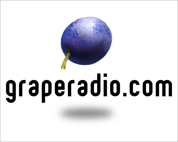
graperadio.com
What started out three years ago as a side hobby for three guys who loved wine, but didn’t know as much as they wanted to know about it, has become one of podcastingdom’s most respected podcasts devoted only to wine. In the process, these guys now know more about wine than most experts as well as having visited many of the world’s greatest wineries and vineyards—all as an enviable business write-off.
The final design was simple and straighforward, incorporating the ethereal levitating grape that also does some representational double-duty as a studio microphone stand-in.
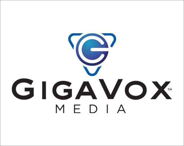
GigaVox Media
GigaVox Media is a company that covers all aspects of the podcasting industry from producing hit podcasts to the promotion and training of others in all aspects of podcast creation. From the technical side to the money-making side. The president of GigaVox Media, Michael Geoghagen, is recognized as one of the early pioneers of podcasting and he tasked Whitestone Design Werks to create an identity that would reflect the stature they had gained in the industry as well as looking great on a studio mic flag. The “G” worked nicely into a power-on symbol that tied the use of technology with the triad outline representing the ability to encompass all that was necessary to raise a voice for all to hear.
GigaVox Media is a company that covers all aspects of the podcasting industry from producing hit podcasts to the promotion and training of others in all aspects of podcast creation. From the technical side to the money-making side. The president of GigaVox Media, Michael Geoghagen, is recognized as one of the early pioneers of podcasting and he tasked Whitestone Design Werks to create an identity that would reflect the stature they had gained in the industry as well as looking great on a studio mic flag. The “G” worked nicely into a power-on symbol that tied the use of technology with the triad outline representing the ability to encompass all that was necessary to raise a voice for all to hear.
Turning Point Christian Fellowship
Turning Point Christian Fellowsip is a young growing church in central Orange County that focuses on reaching out not only to its immediate community but specifically targeting the X generation that is desparately searching for more meaning in life than just being another "consumer".
The mark itself is a play on the name of the church while utilizing the imagery of the cross. The "point" where we realize that we need to "turn" from our old ways is at the cross of Jesus Christ. The type treatment reflects the youthful dynamic of the church while at the same time seeking not to alienate an older generation ("boomers").
Photobank
Photobank Stock Photography, before being purchased by Index Stock Imagery, was originally located in Irvine, California. Photobank was Orange County's premier stock agency and featured it's largest collection of stock photography.
Photobank naturally had to appeal to designers. So it was vitally important for them to improve their image and maintain their premier status among local design firms. The logo, which was produced for David Riley+Associates, played with camera box and lens imagery while borrowing design elements from the typeface that was used for the type treatment. The result was sophisticated yet relevant.
Alleluia Music
Alleluia Music was a label of Integrity Music, located in Mobile, Alabama. Integrity Music is best known for it's extensive collection of beautiful, contemporary praise and worship albums, created and produced by some of the finest Christian musicians and songwriters from all over the world.
Integrity Music was looking for a dynamic feel for the Alleluia label that featured live recorded worship releases. This design was produced for David Riley+Associates and sought to capture that joyful, spontaneous expression of praise which echoed the content of the music. Alleluia Music has since been absorbed into another Integrity label, Hosanna! Music.
O'Neil Relocation
O'Neil Relocation, headquartered in Garden Grove, California, is an agent of United Van Lines. They specialize in providing professional and quality relocation services.
Seeking to capture the progressive nature of the company as well as tie in the nature of their business, this mark, developed for David Riley+Associates, incorporates in the oval shape, a stylization of the "O" in O'Neil. The striped roadway in the mark, was a natural fit for a company whose most visible assets are travelling down it everyday.
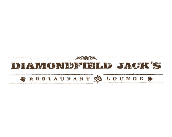
Diamondfield Jack's Restaurant
In Twin Falls, Idaho, the legend of Diamondfield Jack still looms large thanks to the restaurant in the Red Lion Hotel Canyon Springs, that bears his name. They were looking for an image that reflected the local folklore of this larger-than-life figure who had more than his share of run-ins with the law. Seeking to stay away from contrived imagery, WDW sought to capture the rough times that produced some rough characters.
Thanks to the pardoning power of the Governor of Idaho, Diamondfield Jack managed to escape the gallows to live out the rest of his life chasing the elusive motherlode somewhere in the great Nevada Basin.
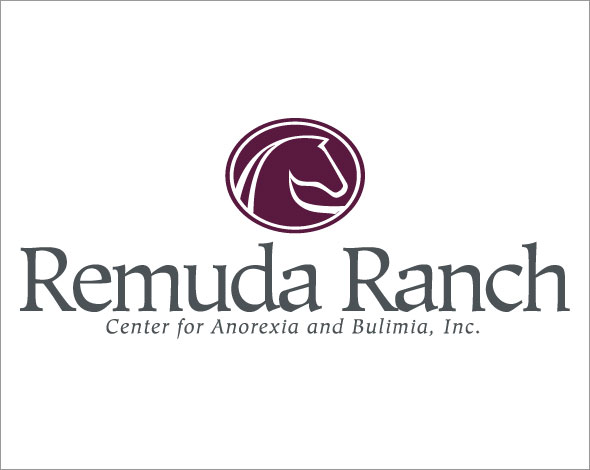
Remuda Ranch
Nestled in the beautiful high desert of Arizona, near Wickenberg, Remuda Ranch is a specialized treatment center where women suffering from anorexia and other eating disorders go to be treated while enjoying a secluded atmosphere removed from their normal, everyday hectic-paced world.
Part of the therapy is horseback riding which lent itself naturally to the stylized equine theme in the mark itself while trying to capture more of a feminine mystique through the type treatment rather than a traditional "dude(ette) ranch" look. New owners took over before the identity had been applied and this design unfortunately lies dormant.
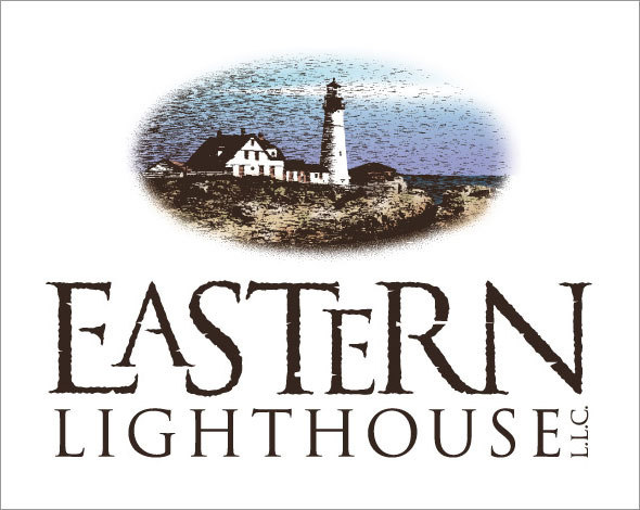
Eastern Lighthouse, LLC
Eastern Lighthouse is the company name for a copywriter in Hamden, Connecticut. Her name is Melinda Ronn and she has specialized in providing copy for many well known non-profit organizations and ministries as well as the White House.
Melinda was looking for a rustic, weathered-look that captured the historic charm of New England. There was the obvious tie-in to the lighthouse theme in developing the illustration for the mark, which helps to define the atmosphere that is unmistakingly, old right coast.
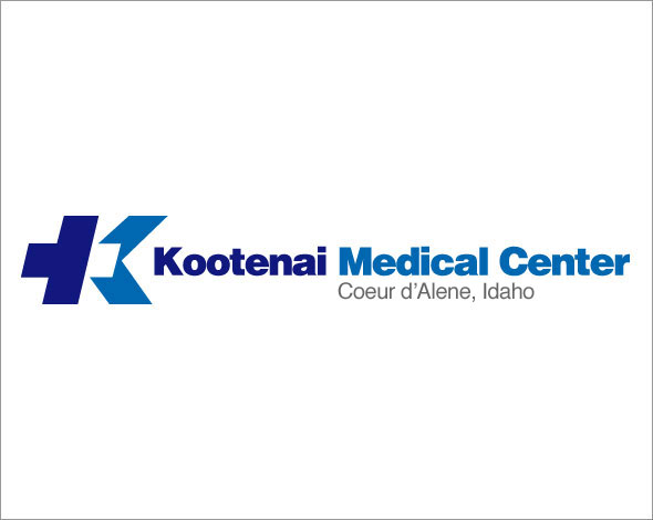
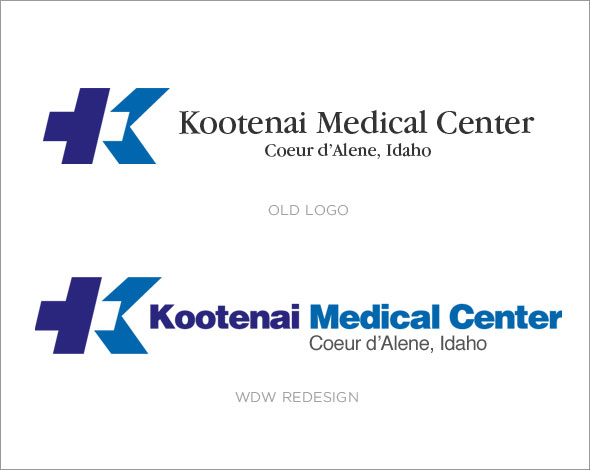
Kootenai Medical Center (refresh)
Kootenai Medical Center had a tremendous amount of equity in their original identity designed by Duane Wiens of Matrix International Assoc. Ltd. out of Denver. The "flying K" as it was affectionately known to the KMC staff was not to be messed with. The type treatment however, hadn't aged as gracefully as the mark had and with the serif typeface, the readability was difficult from distances and greatly increased the complexity of signage fabrication. So KMC, chose WDW to freshen up the type treatment. The refresh brought a weight that was representative of the stature this institution holds in the community while lending itself well to the new signage applications required with the recent expansion of the hospital.
Kootenai Medical Center had a tremendous amount of equity in their original identity designed by Duane Wiens of Matrix International Assoc. Ltd. out of Denver. The "flying K" as it was affectionately known to the KMC staff was not to be messed with. The type treatment however, hadn't aged as gracefully as the mark had and with the serif typeface, the readability was difficult from distances and greatly increased the complexity of signage fabrication. So KMC, chose WDW to freshen up the type treatment. The refresh brought a weight that was representative of the stature this institution holds in the community while lending itself well to the new signage applications required with the recent expansion of the hospital.
Barrel Room No. 6
Barrel Room No. 6 is a great wine bar located in Downtown Coeur d’Alene and is owned and operated as a part of Coeur d’Alene Cellars. The No. 6 designation comes from the number of barrel storage rooms at their main winery which is five. The “sixth” storage room is the downtown wine bar, hence...
Coeur d’Alene Cellars approached Whitestone Design Werks for an identity refresh that would apply well to signage and show a brand hierarchy that would more closely establish it with its parent, Coeur d’Alene Cellars.
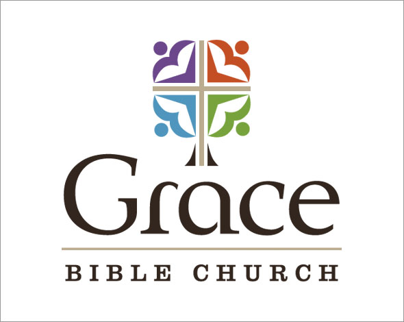
Grace Bible Church
Grace Bible Church in Coeur d’Alene has a long, rich history of being a Bible-teaching, people and family-oriented fellowship and has sought to foster an environment that encourages growth and service to one another, all centered around the work of Jesus on the cross at Calvary. The final mark that was chosen, seeks to reflect those aspects that make Grace Bible Church set apart from the more typical feel-good, seeker-sensitive style that predominates many churches today.
Grace Bible Church in Coeur d’Alene has a long, rich history of being a Bible-teaching, people and family-oriented fellowship and has sought to foster an environment that encourages growth and service to one another, all centered around the work of Jesus on the cross at Calvary. The final mark that was chosen, seeks to reflect those aspects that make Grace Bible Church set apart from the more typical feel-good, seeker-sensitive style that predominates many churches today.
Podcast Academy
The Podcast Academy is the education and training arm of GigaVox Media in the equipping of those that are driving the growing Podcast Industry. Whitestone Design Werks was asked to create a mark that captured the spirit of learning and tie it into the podcasting market. The final design incorporates a symbol of higher education and achievement with a RSS Feed icon emblazoned on the classic mortar board in the familiar RSS orange with a rockin’ tassle silhouette meant to echo Apple’s ubiquitous iPod silhouette ads, which also inspired the name of the very industry itself.
The Podcast Academy is the education and training arm of GigaVox Media in the equipping of those that are driving the growing Podcast Industry. Whitestone Design Werks was asked to create a mark that captured the spirit of learning and tie it into the podcasting market. The final design incorporates a symbol of higher education and achievement with a RSS Feed icon emblazoned on the classic mortar board in the familiar RSS orange with a rockin’ tassle silhouette meant to echo Apple’s ubiquitous iPod silhouette ads, which also inspired the name of the very industry itself.
TMI Travel Management, Inc.
Travel Management, Inc. in Post Falls and Coeur d’Alene is North Idaho’s largest and most respected travel agency and has established an unequaled reputation in the national market that has specialized in the booking of special tours and groups to destinations all over the globe.
WDWerks was tasked with creating an identity that reflected that stature without having to resort to the tired and overused cliché imagery that typifies most travel-related companies. Breaking away from the mold and allowing the full-weight of their reputation to ride on the wordmark alone, TMI has firmly established its leadership position within the industry.
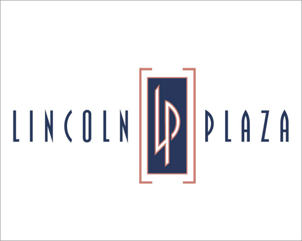
Lincoln Plaza
G&B Real Estate was restoring a venerable Downtown Spokane property to its former glory and needed a new identity that captured the prestige of the address and reflected on the history of the area, while boldy addressing the needs of the present and looking into the future with all the modern amenities and upgrades that successful businesses look for in a Class A office space address. One of the signature features of the property is its extensive use of fine rose marble complimented by neo-art deco atmosphere that has been represented in an identity that portrays the ongoing renaissance in downtown Spokane.
G&B Real Estate was restoring a venerable Downtown Spokane property to its former glory and needed a new identity that captured the prestige of the address and reflected on the history of the area, while boldy addressing the needs of the present and looking into the future with all the modern amenities and upgrades that successful businesses look for in a Class A office space address. One of the signature features of the property is its extensive use of fine rose marble complimented by neo-art deco atmosphere that has been represented in an identity that portrays the ongoing renaissance in downtown Spokane.
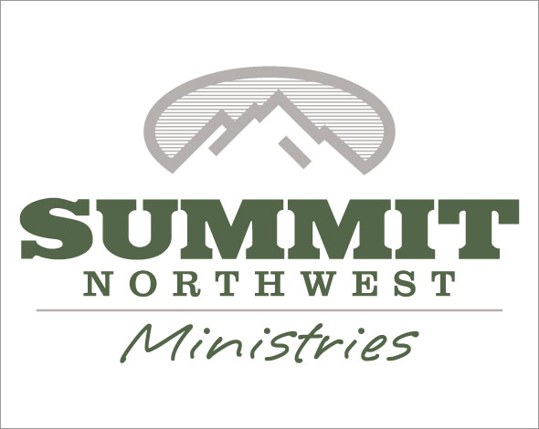
Summit Northwest Ministries
Summit Northwest Ministries is a relatively young church in Post Falls, Idaho that is also young at heart. It is comprised of an active, energetic congregation that very much identified with the outdoor opportunities the Northwest has to offer but also appreciated the symbolism that lifestyle represents, one of pushing on to attain a crown of victory by approaching life in a way that overcame obstacles and trials through the help of one who had already overcome all things—even death—to provide true life and the power to overcome for His people. Whitestone Design Werks was able to provide a solution that incorporated the essence of the Inland Northwest.
Summit Northwest Ministries is a relatively young church in Post Falls, Idaho that is also young at heart. It is comprised of an active, energetic congregation that very much identified with the outdoor opportunities the Northwest has to offer but also appreciated the symbolism that lifestyle represents, one of pushing on to attain a crown of victory by approaching life in a way that overcame obstacles and trials through the help of one who had already overcome all things—even death—to provide true life and the power to overcome for His people. Whitestone Design Werks was able to provide a solution that incorporated the essence of the Inland Northwest.
Cougar Creek Development, LLC
Robert Patterson of Cougar Creek Development was looking for an identity that communicated the rugged nature of the historic and beautiful rural community he lived in south of Coeur d’Alene. He approached Whitestone Design Werks to craft an identity that would also incorporate the imagery of the namesake of the creek that flowed peacefully through his property. The cat needed to represent strength, but he did not necessarily want it to be overly aggressive or look like it was threatening or ready to pounce. The solution incorporated a bit of a juxtaposition of a peaceful water setting with the beautiful feline grace and relaxed strength of the big cat that inspired the early settlers to name a creek after him.
Robert Patterson of Cougar Creek Development was looking for an identity that communicated the rugged nature of the historic and beautiful rural community he lived in south of Coeur d’Alene. He approached Whitestone Design Werks to craft an identity that would also incorporate the imagery of the namesake of the creek that flowed peacefully through his property. The cat needed to represent strength, but he did not necessarily want it to be overly aggressive or look like it was threatening or ready to pounce. The solution incorporated a bit of a juxtaposition of a peaceful water setting with the beautiful feline grace and relaxed strength of the big cat that inspired the early settlers to name a creek after him.
IDENTITY | WEB | PRINT | ENVIRONMENTAL